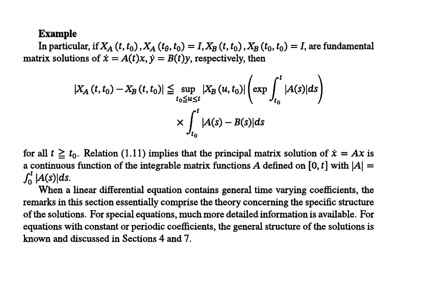
Computer Modern Fonts in are nice, because they are thin. However, there is a certain elegance to old school math books with thicker fonts (see image).

There is a way to get closer, at least with LuaTeX and XeLaTex using
\setmainfont{texgyretermes-regular.otf}[FakeBold=1]
\setmathfont{STIXTwoMath-Regular.otf}[FakeBold=1]
This will give fonts that are thicker, but not as bold as \bold.
Ref: Stockexchange